New Release: Angelic Pretty Misty Sky
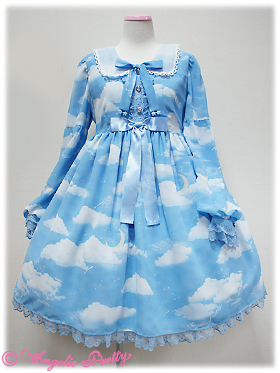
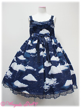
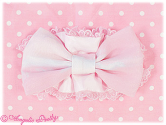
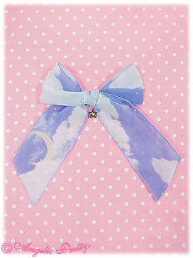
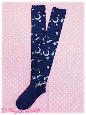
Angelic Pretty came out with a new series the other day; Misty Sky. It follows in the foot steps of some of their other popular celestial themed chiffon pieces, and likely will appeal to fans of fairy-kei in addition to some fans of lolita.
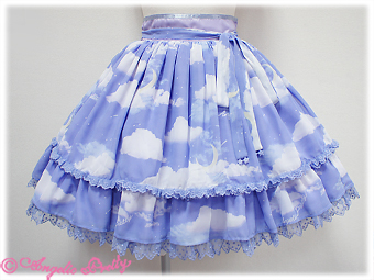
I think the fabric is lovely, but quite frankly, I can’t see myself wearing either of the dresses; the cuts just aren’t right for me. So I was looking at the skirt in periwinkle. However, it’s kinda an odd color, and having recently splurged on an OP from IW (Charles Crown in green) despite having no idea how I’m gonna match things to it, I’m a little wary of jumping down that rabbit hole again. So I went through my closet and tried to come up with a coordinate for it.
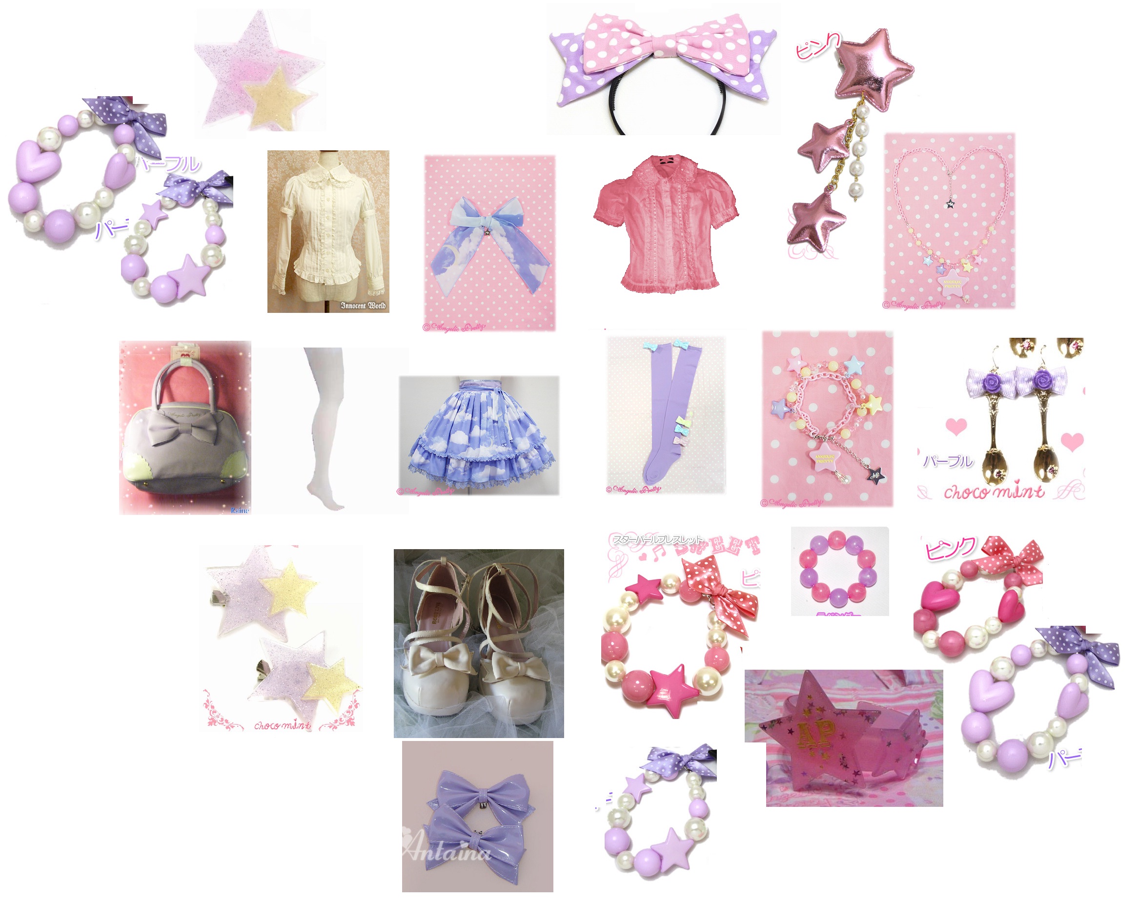
The sugar pink blouse is a bodyline one I bought second hand that the previous owner had dyed; it’s a great color. The shoes are also bodyline. The white blouse is IW, the pink x lavender bracelet is 6% dokidoki and the white tights are off brand. Everything else is a mix of chocomint and AP. On the left is a coordinate in white and lavender. The lavender doesn’t seem to match right and quite frankly, I think it’s boring. On the right, it’s lavender and pink and again, I’m just not thrilled with the result.
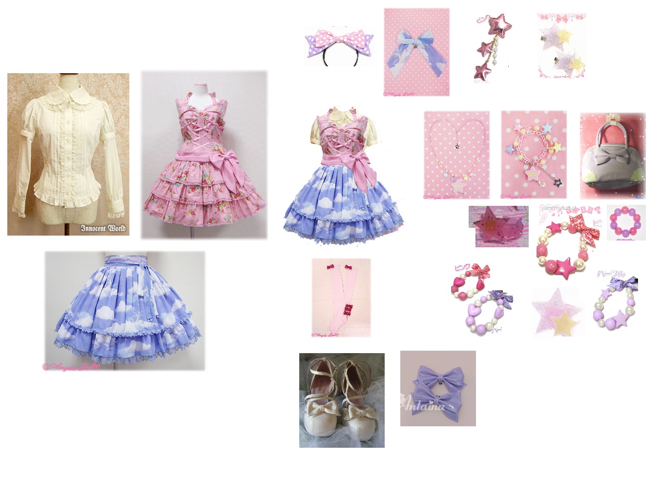
Mostly the same accessories as before, but this time, I introduced a JSK under the skirt. I saw someone do this and I was a little iffy on the idea; and I think in this case, it really just doesn’t quite work. So, I think my verdict is that I really don’t know how to coordinate this skirt in this color. Which is a shame, because I really like it.. but I’m not interested in buying a whole new wardrobe’s worth of accessories just for… I like the navy as well, but I think that might be even harder to match with my wardrobe. The pink is too washed out for my tastes, I don’t like the black… which leaves sax. I love that shade of sax… but I’m not 100% sure how I would coordinate it either. I’m still debating; I may just give this one a pass for now…
